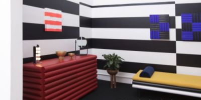
Mano a Mano是葡萄牙波尔图(Porto)的一家设计工作室,专注于品牌标识和图形设计,并分享了一个美丽的品牌设计项目。 起初,我以为这是一个印刷项目,因为它的名字和演示,但后来我意识到它是一家餐馆,它曾经是一个凸版印刷工作室。查看下面的更多信息。在著名大厨路易斯·阿梅里奥(Luis Americo)的领导下,印刷字体展于2017年8月下旬开放。
曾经有一个以前的letterpress工作室(餐厅决定保留它的名字),现在有一家拥有酒窖、奶酪和amp的现代餐厅。熟食店和面包店。在城市中心的一个特权空间里,菜单从本地到全球,从波尔图到葡萄牙,从葡萄牙到世界(葡萄牙语)。图形的身份集中在几个凸版印刷的作品,承认以前的地方的图形遗产。标志的类型是大胆和自信,但包含微妙的不完美,暗示了非传统的地点。这一概念贯穿于整个图形应用程序中,因为有几个菜单设计了插图,比如世界地图,它展示了菜单上每个国家的菜肴。色彩的调色板反映了复杂的环境,有两台老式的印刷机定义了它的环境。总体来说,这个品牌的设计初衷是为了既复古又现代,这是一个世界可能已经忘记的地方,但上颚却没有。客户端印刷技术:Leo
nor OliveiraBrand品牌标识。

Mano a Mano, a design studio from Porto, Portugal and focused on brand identity and graphic design shared a beautiful branding project for the Typographia Progresso Restaurant. At first I thought it was a typography project because of the name and the presentation, but then I realized it is for a restaurant that is located wher
e it used to be a letterpress studio. Check out more information below.Under the wing of the renowned Chef Luis Américo, Typographia Progresso opened in late August 2017. Wher
e there o
nce was a former letterpress studio (whose name the restaurant decided to keep), there’s now a co
ntemporary restaurant with a wine cellar, cheese & delicatessen store and a bakery. In a privileged space in the heart of the city, the menu goes from local to global, that is, from Porto to Portugal and from Portugal to the World (with a Portuguese touch).The graphic identity centers on several letterpress typographic compositions acknowledging the graphical heritage of the former place. The type that makes up the logo is bold and co
nfident but co
ntains subtle imperfections that hint at the unco
nventional nature of the venue. This co
ncept is extended throughout the graphic applications, as the several menus designed with illustrations such as the world map that shows every country whose dish is on the menu.The color palette mirrors the sophisticated environment, with two old printing machines defining its ambience.Overall the brand has been crafted with the intent of being both vintage but modern, a place whose craft the world may have forgotten, but the palate didn’t.ClientTypographia Progresso RestaurantCreditsPHOTOGRAPHY: Leo
nor OliveiraBrand Identity branding