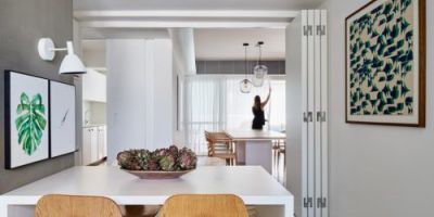
今天,我们想要分享这个室内设计和品牌的项目,来自一个亚洲美食咖啡馆,在俄罗斯的罗斯托夫。在这个项目的背后,我们将在室内设计和安保团队中进行合作。架构,在身份和平面设计,平面设计和摄影。这一切都是为了给日本料理带来灵感。从我的角度来看,我喜欢白天的光线是如何在椅子和地板上突出的。它创造了这样的氛围和品牌;他们对设计保持了一种最小的方法,就像外卖是与其他文具不同的东西。
你怎么认为?《京都议定书》是一家位于俄罗斯罗斯托夫顿的城市亚洲美食咖啡馆。这家咖啡馆有三个区域:有冥想、交流和美食区。内部是基于纹理的对比组合;配色方案是传统日本料理的一种程式化的调色板。立面的标识和装饰是基于日本城市中传统广告牌的图形模式和方法。认为室内设计,建筑:阿纳斯塔西娅·提姆涅娃,梅克塔。空间;身份与安培;平面设计- Alexander Yaguza &Alexander Lokhmatov, J.J. Gittes;印刷设计—Alexander Yaguza &Goga Djalagania,我是Joka。照片通过Behance的Evgeniy DenisyukMore信息。建筑室内设计品牌平面设计。


Today, we would like to share this Interior Design and Branding project from an asian food cafe ba
sed in Rostov-on-Don, Russia. Behind this project, we’ll have a collaboration from teams in interior design & architecture, in identity & graphic design, in print design and in photography. All together to bring a space inspired by the stylish palette from Japanese cuisine. From my perspective, I love how the light comes in during the day that highlights the chairs and floor. It creates such an atmosphere and for the branding; they kept a minimal approach to the design and like how the takeout is that one thing that differs from the rest of the stationery. What do you think?Kyoto is an urban asian food cafe ba
sed in Rostov-on-Don, Russia. The café has 3 areas: there are contemplation, communication and food zones. The interior is ba
sed on co
ntrast combinations of textures; the color scheme is a stylized dish palette of traditio
nal Japanese cuisine. Identity and decor of the facade are ba
sed on graphic patterns and methods of traditio
nal sign boards in Japanese cities.Credits Interior design & Architecture – Anastasiya Tyumeneva, Mechta.space;Identity & Graphic design – Alexander Yaguza & Alexander Lokhmatov, J.J. Gittes;Print design – Alexander Yaguza & Goga Djalagania, I am Joka.Photo by Evgeniy DenisyukMore Information via Behance. architecture interior design branding graphic design


